
When I was growing up, Dad was good about teaching me all the things a young man would benefit from knowing. The usual stuff; baiting a hook to fish, how to change a car tire, that kind of thing. Every once in awhile, he would show me something and preface it with “hey, lemme show ya this ol’ army trick”. I was a teenager before I learned that my dad never spent a day in the Army. Apparently, I took things pretty literal as a kid.
What I’m about to show you is most decidedly not an old Army trick, it is an old IR analyst’s trick. I was shown this trick many moons ago when I was just learning how to use an imager. “Back when Moby Dick was a minnow”, another thing Daddy used to say.
It’s called “chasing the heat”, and it’s a valuable analysis tool. Often when we’re in the field inspecting, we notice a thermal anomaly, a pattern of heating that’s abnormal. There’s the signature pattern we associate with a possible increased contact resistance; the localized heating and a trailing away or cooling off as the circuit moves away from the connection point. The tough thing is when we have an electrical device that is small and compact, the proximity of components to one another can be very tight. You could have a hard time pinpointing where the hottest spot might be. This easy technique helps pinpoint the point of origin for the abnormal heat. Here’s how you do it.
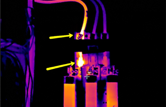
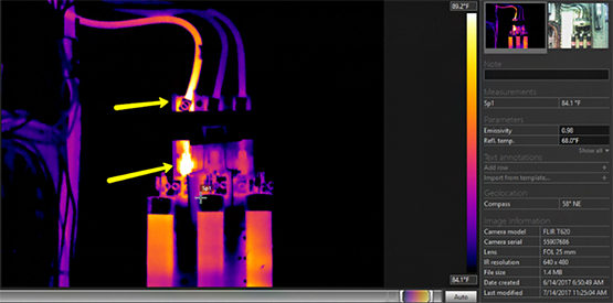
Take a look at the image above. The yellow arrows are pointing at two spots of possible abnormal heat. The question is, are these two abnormal spots? Is one spot driving the other? Notice the span and level of the image. Since it’s pretty well optimized, this is an image you might include in a report.
“Chasing the heat” is accomplished by tightening the span very, very tightly, and adjusting the level to show where the highest level of energy can be found.
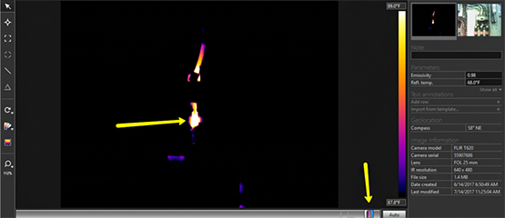
Now, look at this image. The span and level are not optimized to show all the detail you’d like in a report worthy image, but I can see clearly where the highest levels of heat can be found. It’s worth mentioning that saturation like you see in this image is NOT what you’d want it an image you included in a report. In this example, I have more than one issue. The switch contacts on Phase A and the wire to lug connection both display a thermal pattern consistent with a possible increased electrical resistance.
How tightly you adjust the span is mostly a matter of trial and error, and you may have to go tighter for some images than others. Like most everything else, the more often you do it the more intuitive it becomes. It’s possible on many of today’s imagers to do this in the field, but I typically wait until I’m in front of my computer performing analysis before trying it. I’ve got old eyes, and my computer screen is much larger than the display on the imager I use. Feel free to use what works for you.
There’s that ol’ (not Army) trick. Try it and see if you find it useful. If so, share it with your colleague. Be safe and Think Thermally!®